top of page


BRANDING | VISUAL IDENTITY | PACKAGING DESIGN | PRINTED ADVERTISEMENTS
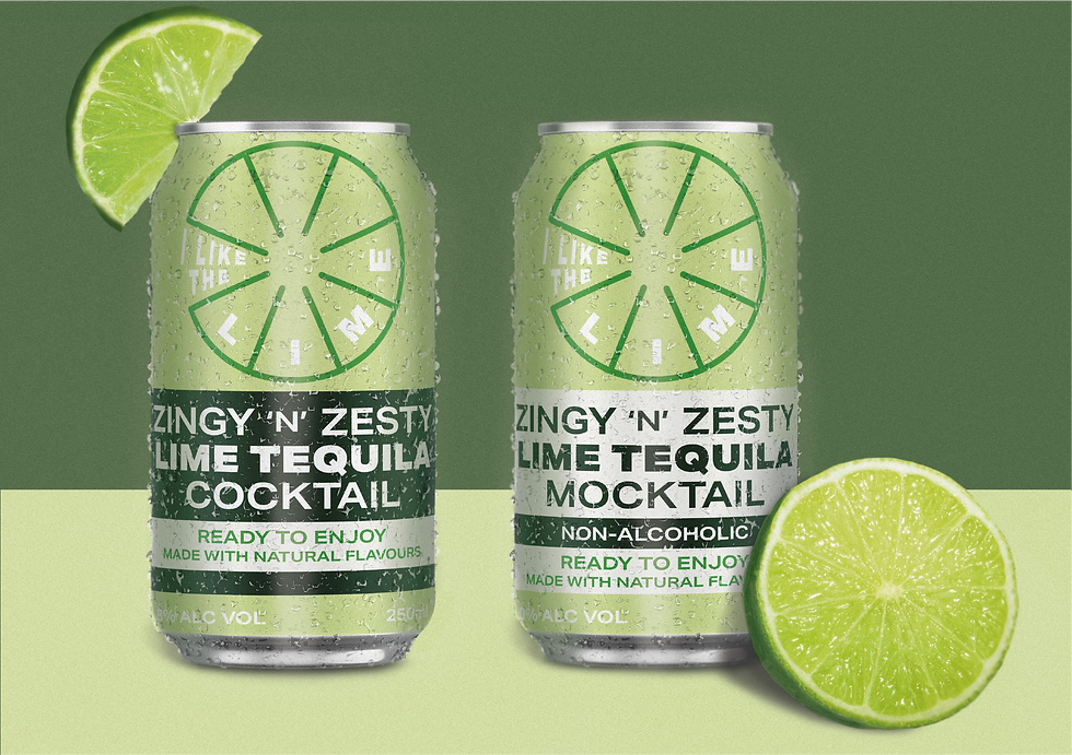
This mini project has focused on developing a flat design, including a simplistic logo, limited colour scheme, and casual language. Through integrating these design elements within the branding and campaigning, the outcome should reflect a recognisable beverage that lures the public into purchasing these cans in their local supermarket. To ensure inclusion for everyone, the designs of the cans reflect the same energy of fun and enjoyment, through using a slightly different colour order and using the word “mocktail” instead of “non-alcoholic” to clearly, yet subtly, differentiate the two beverages whilst reflecting the involvement of including everyone with their preference towards drinks. This was a fun opportunity to explore how to highlight the zestiness of these beverages.


bottom of page