top of page


BRANDING | VISUAL IDENTITY | PACKAGING DESIGN | ILLUSTRATION | ANIMATION
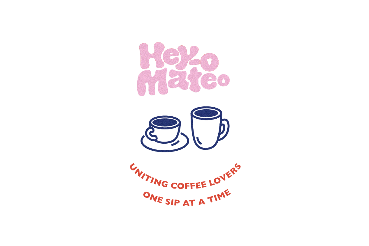
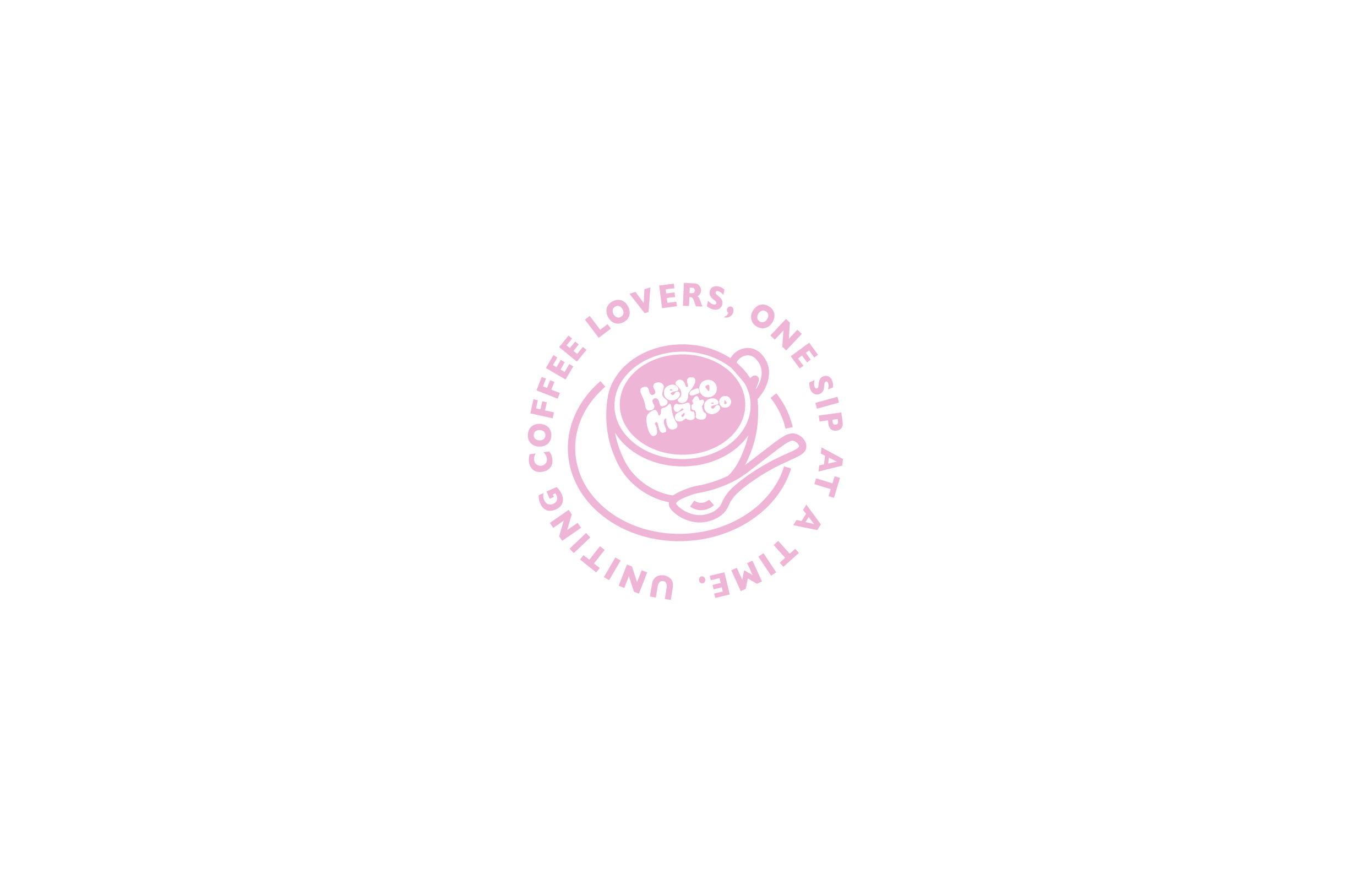
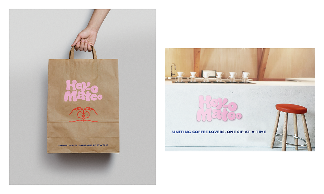
This cafe's identity was created around reflecting a trendy environment to involve yourself in - whether that be meeting up with old friends, having a solo ‘study sesh’, or a low-key, cosy spot for a first date. Reflecting a quirky, contemporary feel through the use of simplistic illustrations and contrasting colour scheme, as well as Hey-o Mateo’s funky jumbled logo, this cafe prioritises making customers feel welcomed into the shop through their stylish branding. Hey-o Mateo’s name generates a catchy, memorable term that is fun to pronounce and compliments the brand’s vision of providing the public with a go-to place to feel chillaxed, taking in the fresh, friendly environment.


bottom of page