top of page

BRANDING | VISUAL IDENTITY | PACKAGING DESIGN | ILLUSTRATION | ANIMATION
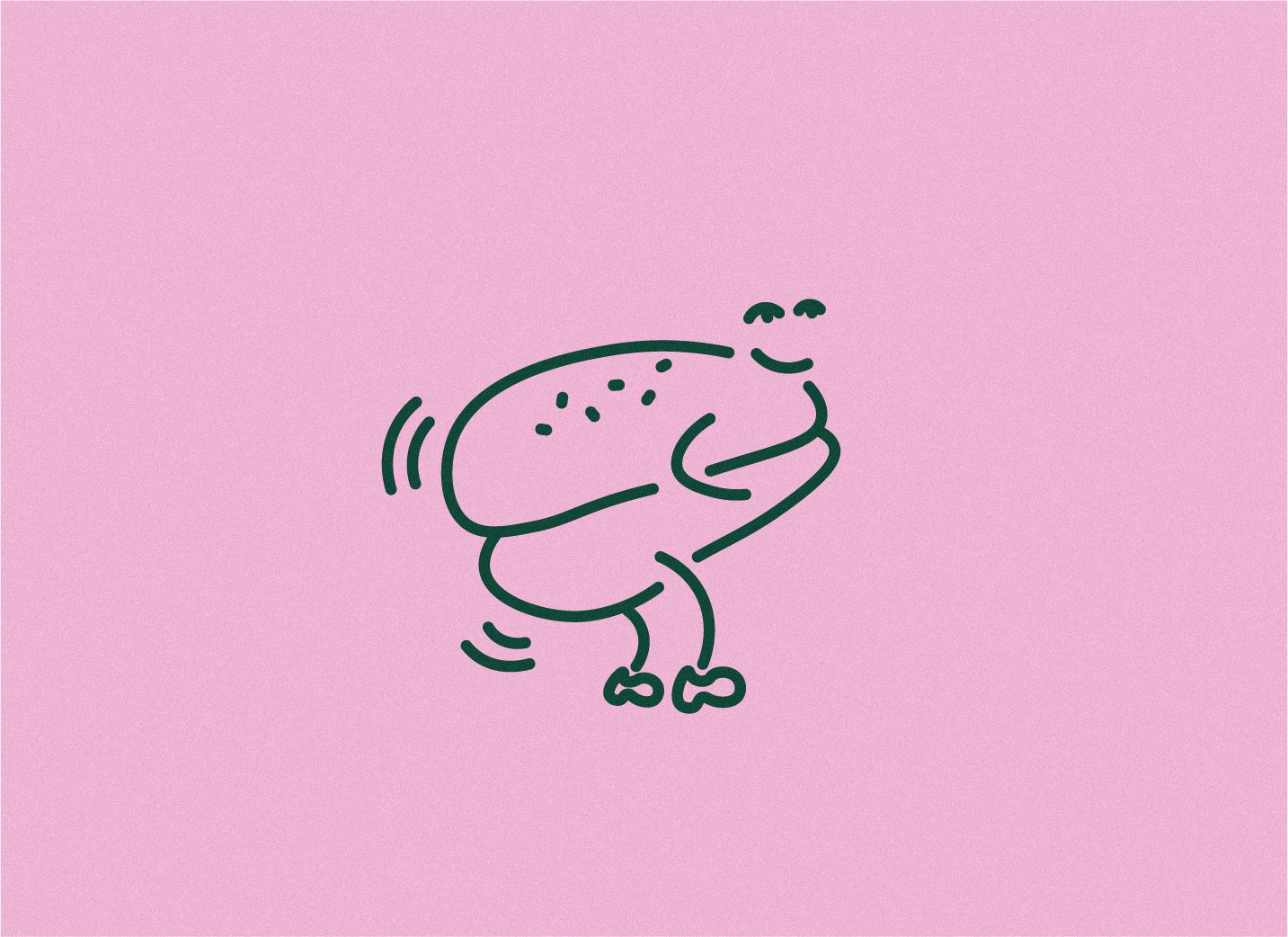
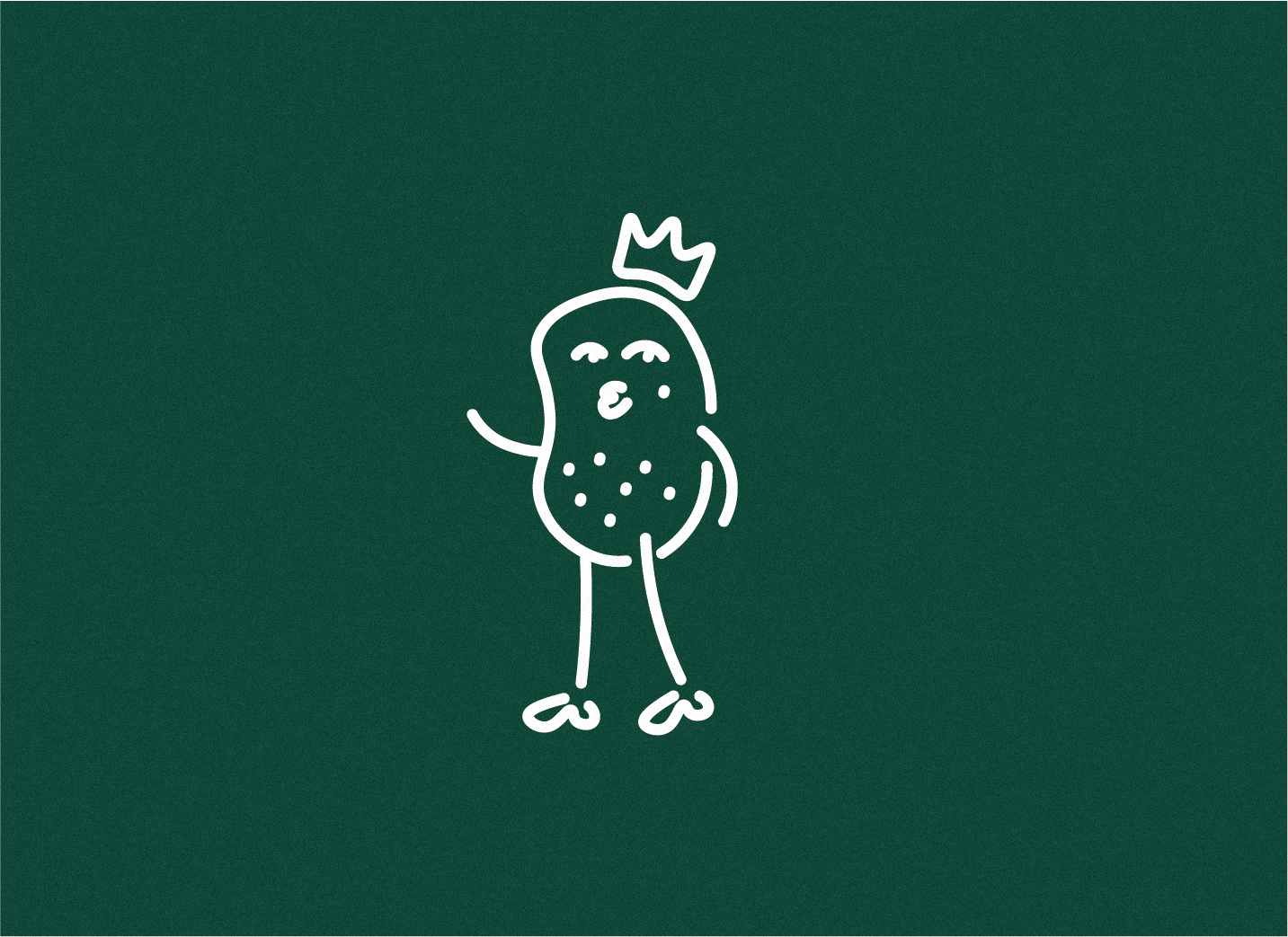
For the foodies who love to scran, this burger bar focuses its attention not only on cooking up the juciest burgers on the block, but also on reflecting a unique and dynamic visual approach towards branding within the fast-food industry. Using contrasting colours and illustrations paired with bold typefaces inspired by retro time periods, this method of branding strategically boasts an identity that differentiates from other burger joints on the high street. Stepping away from the usual red-orientated colour scheme, the use of pink and green intends to get the public to pause and take a closer look at what the burger bar has to offer, whilst allowing a deeper admiration towards the branding's quirky characteristics.


bottom of page